Brief
Rebranding, new packaging, photography, and video production for a crowdfunding campaign. Made from 100% Italian ingredients, this pasta is cultivated using environmentally friendly techniques and produced with ancient grains specific to each region where it is grown. The goal was to highlight the names of the different pasta shapes, each telling the story of its region of origin.
solution
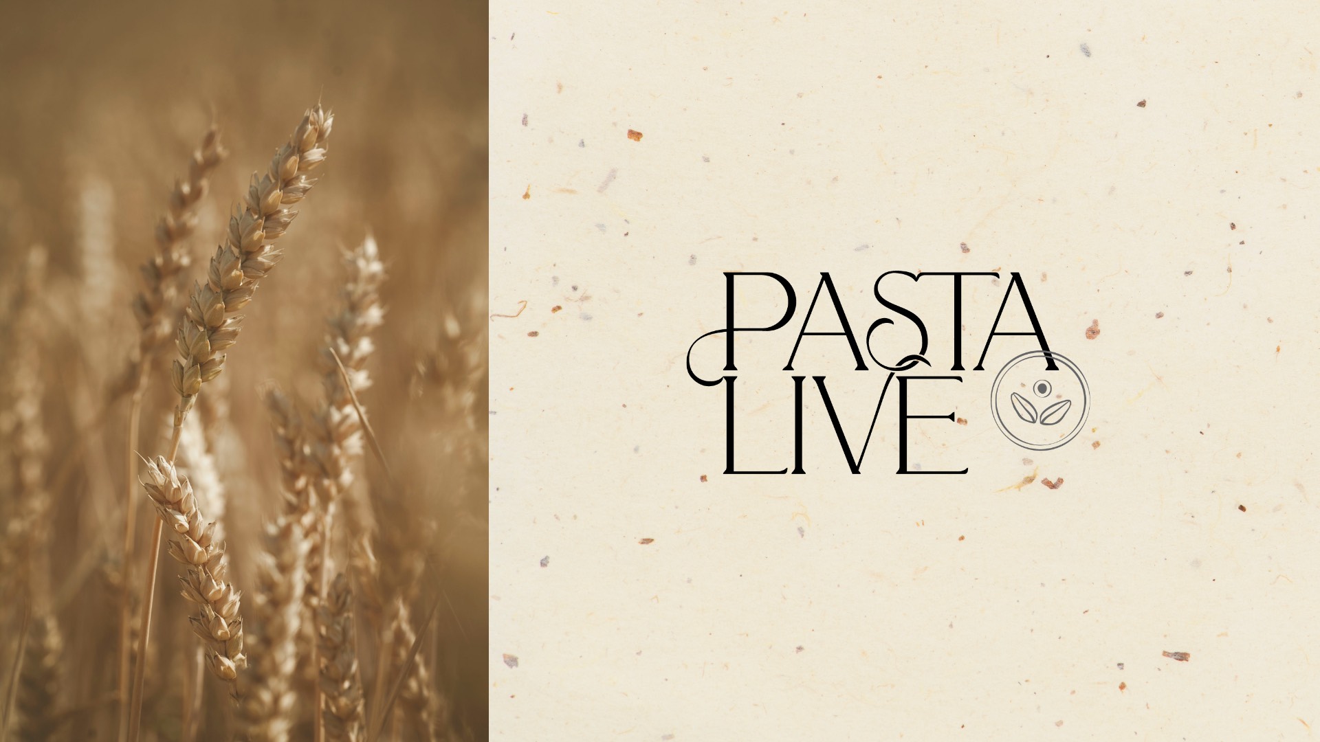
The logo was designed with fluid, harmonious lines, representing nature in perfect balance — both strong and delicate. For the packaging, we chose to distinguish each region of cultivation using unique colours that symbolise their defining characteristics. The story behind each pasta shape’s name is told directly on its packaging, immersing the customer in the history of the region.
A key aspect of the branding was to emphasise the artisanal quality of the pasta. Hand-drawn illustrations of the pasta shapes and custom-made stamps further enhance this sense of craftsmanship, reinforcing the authenticity and uniqueness of the product.